Value
The darkness or lightness of a color. Tone. Tonal value
The darkness or lightness of a color. Tone. Tonal value
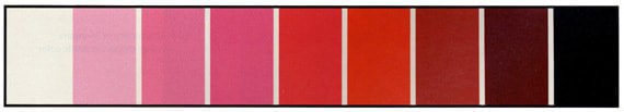
In the value scale above, the pure red is the sixth box from the left (In a value scale for yellow, the pure yellow might be the second box from the left.).
Chroma
1. The purity of a color, or its freedom from white or gray.
2. Intensity of distinctive hue; saturation of a color.
1. The purity of a color, or its freedom from white or gray.
2. Intensity of distinctive hue; saturation of a color.
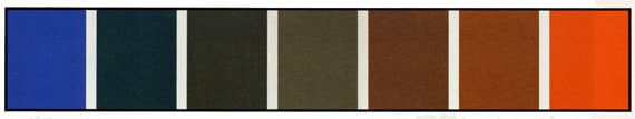
The two complementary colors of blue and orange are in their purest, most intense/saturated states on the far sides of this scale. By mixing them together gradually, the resulting colors will become increasingly neutral in temperature and will lose intensity. This will work for all pairs of complementary colors.
(For more color concepts, refer to the Color Glossary.)
Combined Color Value Scale / Intensity Scale
Combined Color Value Scale / Intensity Scale
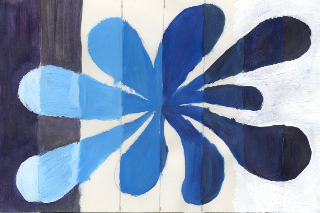
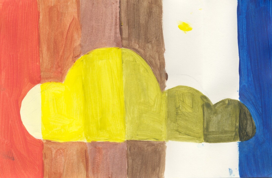
- Divide a 6 x 9” paper into a strip of 7 segments, such as in a value scale
- Create a single interesting closed shape that fills most of the picture plane and crosses into all 7 segments.
- In the positive spaces (inside the large interesting shape), paint a monochromatic value scale in the divisions using only one color, white, and black. The color should only be used on its own, or with white, or with black (i.e. You should not mix color + white + black). You are making tints and shades (If using watercolors and not acrylic, skip using white and just use water to thin the color to a light version.).
- In the negative spaces (the area outside the interesting shape), use the divisions to create an intensity scale, using two complementary colors on either end and mixing one into the other in small increments as you move towards the middle, so that the middle of the scale is a neutral (brown or gray).
Here's an example of how it will look after the first stage is complete. The positive space of the design (The interior of the shape) is a monochromatic value scale using blue. The negative space (outside the shape) will be an intensity scale going from violet on the left side to yellow (the complementary color of violet) on the right.
And below is another example of how it will look a little later (This one is still not yet complete.). By mixing the complementary colors together a little at a time (in the outside section), you will get a neutral color (a brown or gray) in the center.
And here are the finished versions:
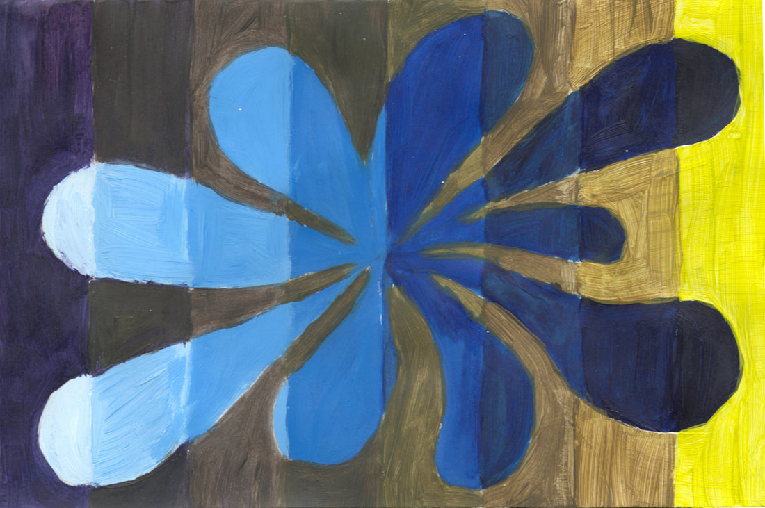
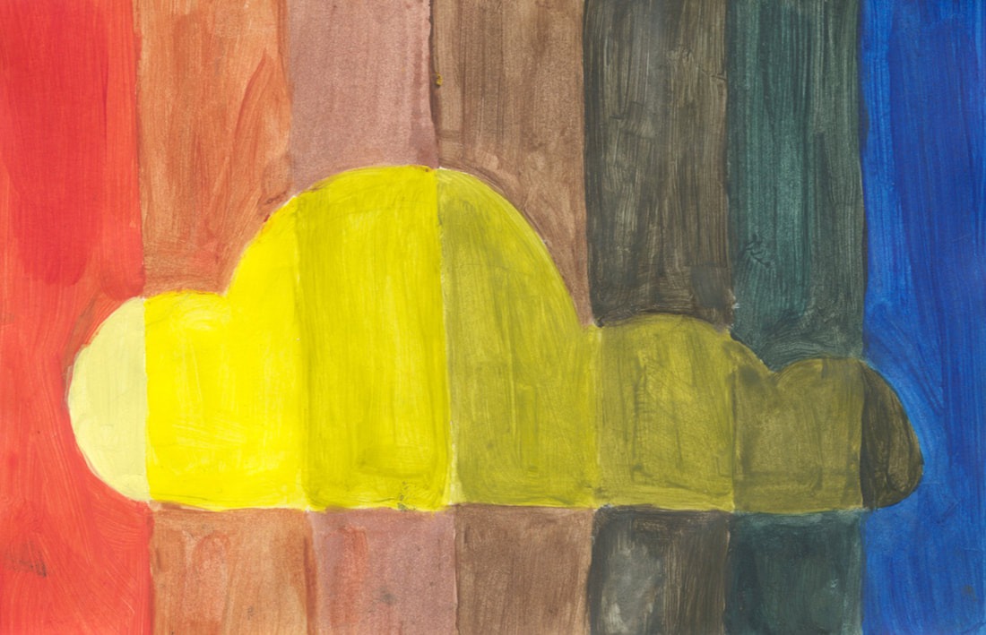
The examples are by Vela B. and Julia D.
 RSS Feed
