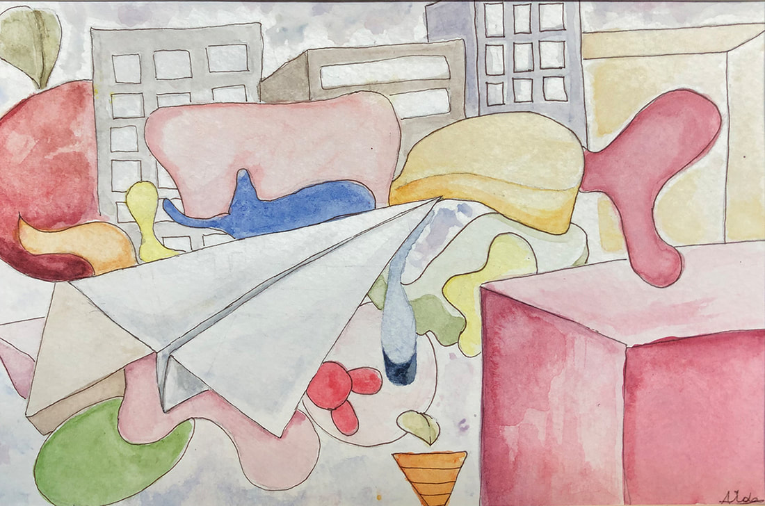
 Aida Gachago, Class of 2020 Project:
On a piece of watercolor paper, create a design that considers the Principles of Art, and use that to experiment with different mark-making using watercolors. Apply your understanding of Unity, Emphasis, Balance, Harmony, and Variety in the design. What you will need:
Objectives:
Process:
If you can't fit all these techniques into a single design, create a second design to try out the remaining techniques. Select a photograph of an animal (Better yet, take a great photo of your own pet.). The photo should have a good variety of color and TEXTURE.
On a piece of chipboard (gray cardboard) or heavy drawing paper, draw the composition and shapes of the photograph. Be accurate in the proportion and placement of shapes, and the directions of the contours (lines, edges). Using acrylic paint, paint using the photograph as a reference. Mix your colors to match the hues and values of the photograph. To start, "block in" the major colors to cover the painting surface quickly, then refine with additional layers. Render the textures using painting methods. (Note: Generally, working from photographs is not advised. It's generally better to paint from life, and the photographs of other artists are considered their intellectual property. This is an exercise to learn to create accuracy of color hue, value, and texture. As such, it cannot be considered an "original" work, but you'll learn a lot about painting by doing it.) ------------- Seleccione una fotografía de un animal. La foto debe tener un buen rango de color y textura. En una pieza de aglomerado (cartón gris) o papel de dibujo pesado, dibuje la composición y formas de la fotografía. Sea preciso en la proporción y ubicación de las formas, y las direcciones de los contornos (líneas, bordes). Usando pintura acrílica, pinta usando la fotografía como referencia. Mezcle sus colores para que coincidan con los tonos y valores de la fotografía. Para comenzar, "bloquea" los colores principales para cubrir la superficie de pintura rápidamente, luego refina con capas adicionales. Renderiza las texturas usando métodos de pintura. (Nota: Generalmente, no se recomienda trabajar desde fotografías. Generalmente es mejor pintar de la vida, y las fotografías de otros artistas se consideran su propiedad intelectual. Este es un ejercicio para aprender a crear precisión en el tono, el valor y la textura del color. Como tal, no puede considerarse un trabajo "original", pero aprenderá mucho sobre pintura al hacerlo). Project:
Using oil pastels, "paint" a still life comprised of one or two cereal boxes or other packages. Include the table surface, wall, and cast shadows in your drawing. Set up a cereal box on a table top. Light the set up with a single light source, so that there are clear changes in darkness on each of the sides of the box. This is to be done from direct observation, not from a photograph. Objectives:
Materials:
Grading Criteria:
Below are some contemporary painters to look and to learn from. Remember to concentrate on the changes in color even within the same surfaces/planes. Also remember that every change in direction (every plane) will have a shift in value and in color temperature. Typically, shadows will be cooler in color (bluer) and where the light hits will be warmer (more yellow, orange, or red), but not always. Dik Liu Wayne Thibaud To Start:
Materials:
Steps: 1. Copy the basic composition and all the major shapes of a master painting (a painting by a famous historical artist, one of "The Masters") -- Choose from the reproductions provided in class or from this folder. Make sure all the shapes are CLOSED shapes (that can be filled in). The placement and proportions of the shapes are to be accurate, but small detail isn't necessary. 2. Divide the painting into five sections. 3. Paint each of the sections with one of the following color schemes:
Refer to the Glossary of Color Concepts ---------------- Copia de 5 secciones de Masterpainting Copie la composición básica y todas las formas principales de una pintura maestra (una pintura de un famoso artista histórico, uno de "Los maestros"). Elija entre las reproducciones proporcionadas en clase. La ubicación y las proporciones de las formas deben ser precisas, pero los pequeños detalles no son necesarios. Divida la pintura en cinco secciones. Pinte cada una de las secciones con uno de los siguientes esquemas de color: Monocromo Neutral Análogo Triádico Mezcle para que coincida con el original ------------- GLOSARIO DE COLOR Matiz Clasificación de un color como rojo, azul, verde o amarillo en referencia al espectro. Chroma 1. La pureza de un color, o su libertad de blanco o gris. 2. Intensidad de matiz distintivo; saturación de un color. Temperatura Las temperaturas de color más altas son colores fríos (blanco azulado); las temperaturas de color más bajas son de colores cálidos (de blanco amarillento a rojo). Valor La oscuridad o la levedad de un color. Tono. Valor tonal Colores primarios Los colores base a partir de los cuales se pueden mezclar otros colores: rojo, amarillo, azul. Colores secundarios Un color, como naranja, verde o violeta, producido al mezclar dos colores primarios. Colores intermedios Los colores intermedios son la "tercera" categoría de color. Se hacen mezclando un color primario y uno secundario juntos. Color terciario Un color, como marrón, producido al mezclar dos colores secundarios. Complementario Uno de un par de colores primarios o secundarios uno frente al otro en la rueda de color, como verde opuesto al rojo, naranja opuesto al azul o violeta opuesto al amarillo. Monocromo Tener una variedad de tonos de un solo color Neutral Colores que no son ni cálidos ni fríos. Grises y marrones son colores neutros. Análogo Colores que son adyacentes entre sí en la rueda de colores. Triádico: colores en un triángulo equilátero en la rueda de colores; como rojo, amarillo y azul; o naranja, verde y violeta Tinte Un color diluido en blanco un color de pureza, cromo o saturación inferiores a la máxima. Un color delicado o pálido. Sombra El grado de oscuridad de un color, determinado por la cantidad de negro o por la falta de iluminación. Opacidad Opaco no transparente o translúcido; impenetrable a la luz; no permitiendo que la luz pase. Transparente fácilmente visto a través Value The darkness or lightness of a color. Tone. Tonal value 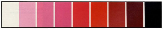 In the value scale above, the pure red is the sixth box from the left (In a value scale for yellow, the pure yellow might be the second box from the left.). Chroma 1. The purity of a color, or its freedom from white or gray. 2. Intensity of distinctive hue; saturation of a color.  The two complementary colors of blue and orange are in their purest, most intense/saturated states on the far sides of this scale. By mixing them together gradually, the resulting colors will become increasingly neutral in temperature and will lose intensity. This will work for all pairs of complementary colors. (For more color concepts, refer to the Color Glossary.) Combined Color Value Scale / Intensity Scale
Here's an example of how it will look after the first stage is complete. The positive space of the design (The interior of the shape) is a monochromatic value scale using blue. The negative space (outside the shape) will be an intensity scale going from violet on the left side to yellow (the complementary color of violet) on the right. 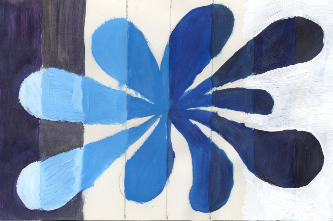 And below is another example of how it will look a little later (This one is still not yet complete.). By mixing the complementary colors together a little at a time (in the outside section), you will get a neutral color (a brown or gray) in the center.  And here are the finished versions: 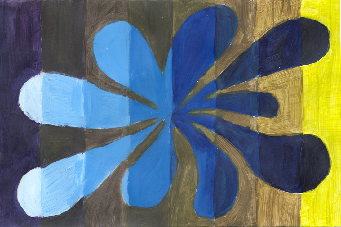 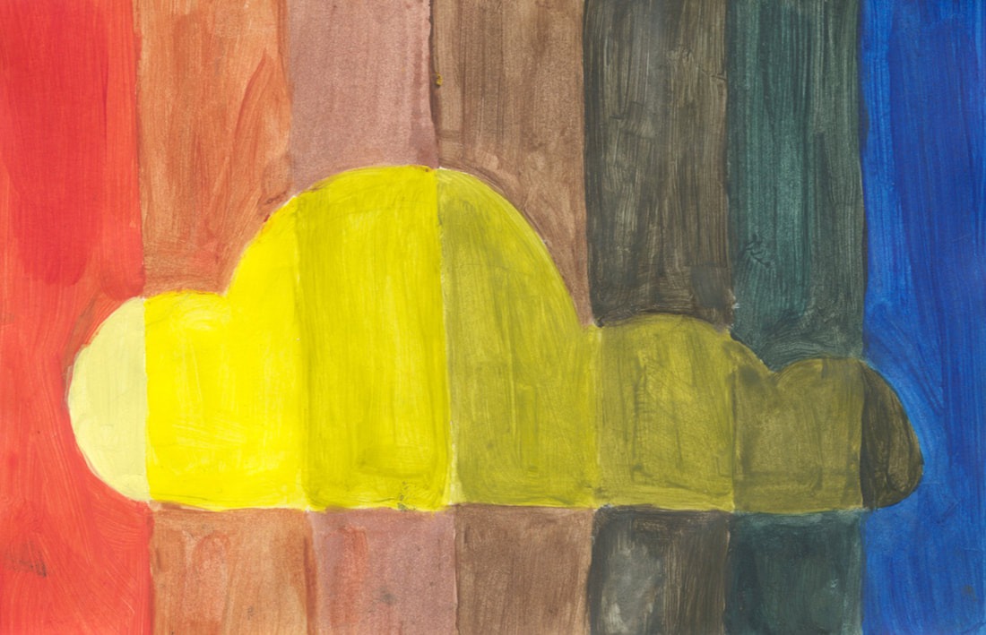 The examples are by Vela B. and Julia D.
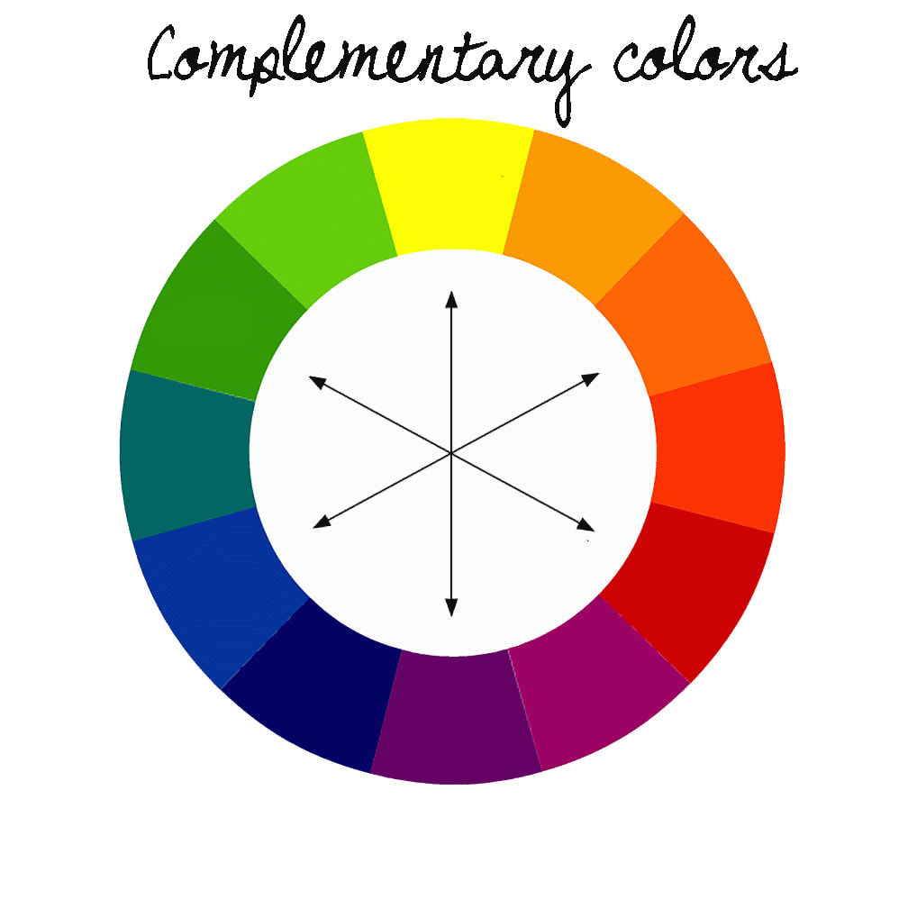 Complementary Colors:
Colors that are opposite each other on the color wheel are considered to be complementary colors (example: red and green). The high contrast of complementary colors creates a vibrant look especially when used at full saturation. Assignment: Paint a complementary color wheel. Materials Acrylic Paint: Medium Yellow, Medium Red, and Ultramarine Blue Bristle Brushes Palette Knife Water Containier Paper Towel 9 x 12" 80 lb Drawing Paper 1. Draw a word from this list in capital letters to fill your paper. The letters should be shapes that you can paint inside (i.e. "block" letters). 2. Divide the paper into 12 triangles by drawing 6 straight lines through a central point. 3. Using only yellow, red, and blue, paint inside the letter shapes with the colors of the color wheel. Start with yellow (Some students find it easier to indicate the colors by penciling the initials of the colors before painting.). 4. In the forms outside and around the letters, within each triangle, you will use colors that are opposite (or "complements") of the letters. That is, if the letter is painted yellow, the area outside the letter (but within that triangle) will be painted violet. Look at the color wheel above to determine complements. 5. Clean your brushes well at the end of each class with soap and water. Lay them flat. Cover your paintings so they don't dry out overnight. ---------- Tarea: el próximo jueves: una caricatura: cabeza, cuello y hombros de un personaje con una expresión exagerada. Color con pasteles al óleo. 1. Dibuja tu nombre (grande) en letras mayúsculas para llenar tu papel. Las letras deben ser formas que puedas pintar adentro. 2. Divida el papel en 12 triángulos dibujando 6 líneas rectas a través de un punto central. 3. Pinte dentro de las formas de letras con los colores de la rueda de colores. Comience con amarillo. 4. En las formas fuera y alrededor de las letras, usará colores que son opuestos (o "complementos") de las letras. 5. Limpie sus pinceles muy bien al final de cada clase, con agua y jabón. Cubra sus pinturas para que permanezcan húmedas durante la noche.  GLOSSARY OF COLOR Hue Classification of a color as red, blue, green, or yellow in reference to the spectrum. Chroma 1. The purity of a color, or its freedom from white or gray. 2. Intensity of distinctive hue; saturation of a color. 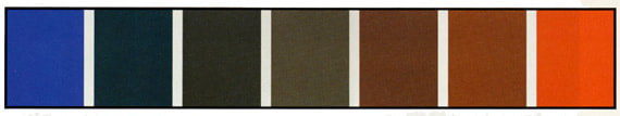 Temperature Higher color temperatures are cool (blueish white) colors; lower color temperatures are warm (yellowish white through red) colors. Value The darkness or lightness of a color. Tone. Tonal value 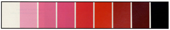 Primary Colors The base colors from which other colors can be mixed: red, yellow, blue. Secondary Colors A color, as orange, green, or violet, produced by mixing two primary colors. Intermediate Colors Intermediate colors are the "third" category of color. They are made by mixing a primary and a secondary color together. Tertiary Color A color, as brown, produced by mixing two secondary colors. Complementary One of a pair of primary or secondary colors across from each other on the color wheel, as green opposed to red, orange opposed to blue, or violet opposed to yellow. 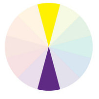 Monochromatic Having a variety of tones of only one color Neutral Colors that are neither warm nor cool. Grays and browns are neutral colors. Tint A color diluted with white; a color of less than maximum purity, chromo, or saturation. A delicate or pale color. Shade The degree of darkness of a color, determined by the quantity of black or by the lack of illumination. Analogous Colors that are adjacent to each other on the color wheel. 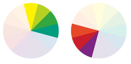 Triadic Colors in an equilateral triangle on the color wheel; such as red, yellow, and blue; or orange, green, and violet 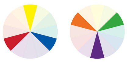 Opacity
Opaque not transparent or translucent; impenetrable to light; not allowing light to pass through. Transparent easily seen through Some definitions are taken from dictionary.com and wikipedia.com. |
AuthorMr. Ratkevich Archives
January 2023
Categories |
| Studio Art Honors I |
|
 RSS Feed
