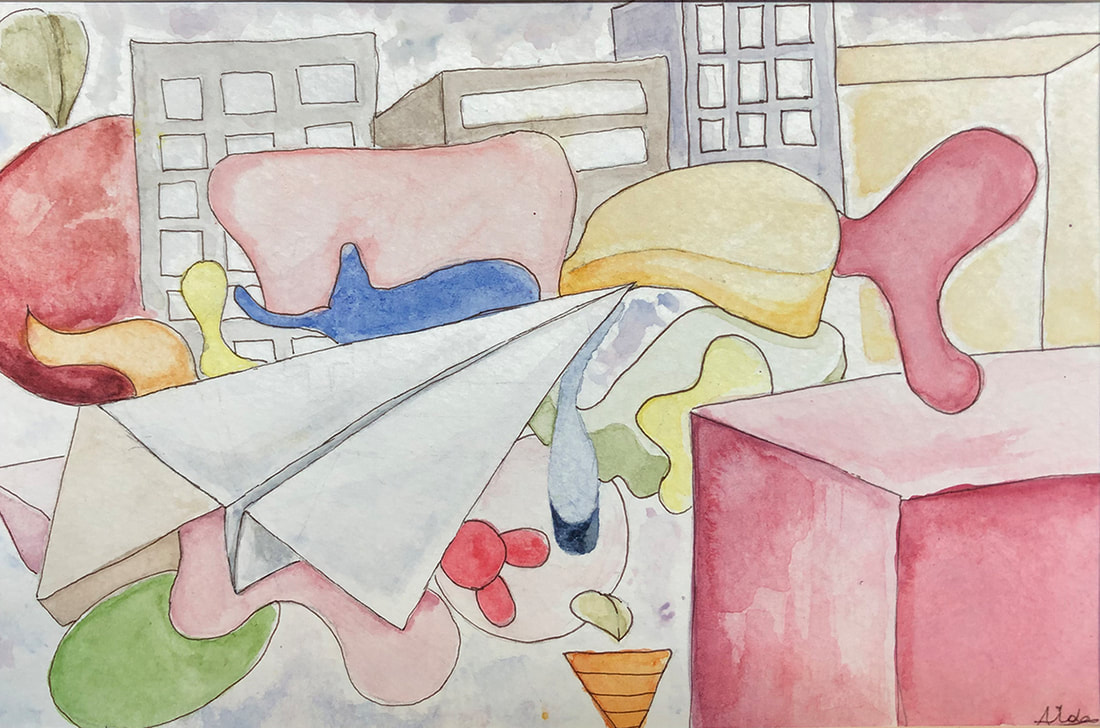
Aida Gachago, Class of 2020
Project:
On a piece of watercolor paper, create a design that considers the Principles of Art, and use that to experiment with different mark-making using watercolors. Apply your understanding of Unity, Emphasis, Balance, Harmony, and Variety in the design.
What you will need:
Objectives:
Process:
If you can't fit all these techniques into a single design, create a second design to try out the remaining techniques.
On a piece of watercolor paper, create a design that considers the Principles of Art, and use that to experiment with different mark-making using watercolors. Apply your understanding of Unity, Emphasis, Balance, Harmony, and Variety in the design.
What you will need:
- Watercolor set (pan or tubes)
- Watercolor palette / plastic watercolor pan (for color mixing)
- Two cups of water (one for cleaning brushes, one for adding to and mixing colors)
- Sable brushes
- Paper towel
- Watercolor paper
- Pencil (HB)
- (Salt)
- (Crayons)
- (Artist's tape, or masking tape)
Objectives:
- Learn to control the watercolor medium to mix a wide range of specific colors.
- Develop skill with watercolor to paint both larger areas and small details.
- Create depth using atmospheric perspective through color shifts -- More vibrant, and usually warmer, as the objects are closer to you; less saturated, less intense, and cooler as they move away.
- Learn to paint gradations/transitions of color
- Experiment with the medium
Process:
- For inspiration on your composition, look at the work of abstract painters Paul Klee and Wassily Kandinsky.
- Create a drawing/design in light pencil line that is composed of at least 20 closed organic and geometric shapes. Compose the image by applying what you know about the Principles of Art, specifically Unity, Emphasis, Balance, Harmony, and Variety.
- Then, paint the design using watercolor so that it includes:
- At least 10 mixed colors (Colors not straight from the tubes, but mixed together.)
- Washes
- Smooth, flat color swatches with crisp edges
- Pale colors
- Intense colors
- Gradations of dark to light
- Gradations of one color changing to another
- Lines, both thin and broad
- Points, dashes, and other marks
- Layers of colors (painting transparent colors over dry colors)
- All other basic techniques described in this handout (Burlington access only)
If you can't fit all these techniques into a single design, create a second design to try out the remaining techniques.

 RSS Feed
